Aurorum corporate identity
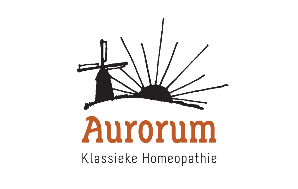
The visual mark for the Aurorum logotype represents on one side the meaning of Aurorum: dawn; on the other side the rural environment where the company is based, drawn further into the illustrative, artesanal style. The logotype’s font has been designed specially for Aurorum, and represents with its fluent shapes the homeopathic process: taking care of a solid base in order to go back to the essence of the individu.
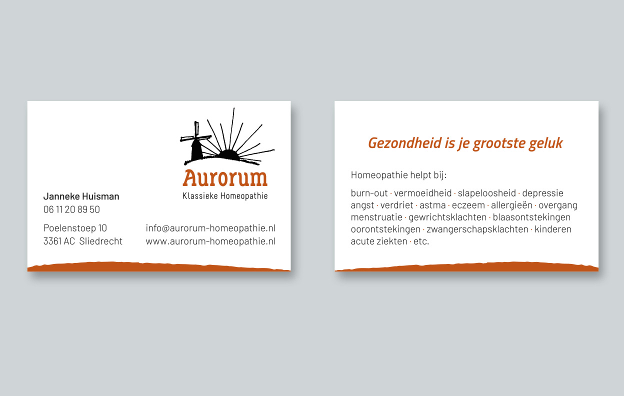
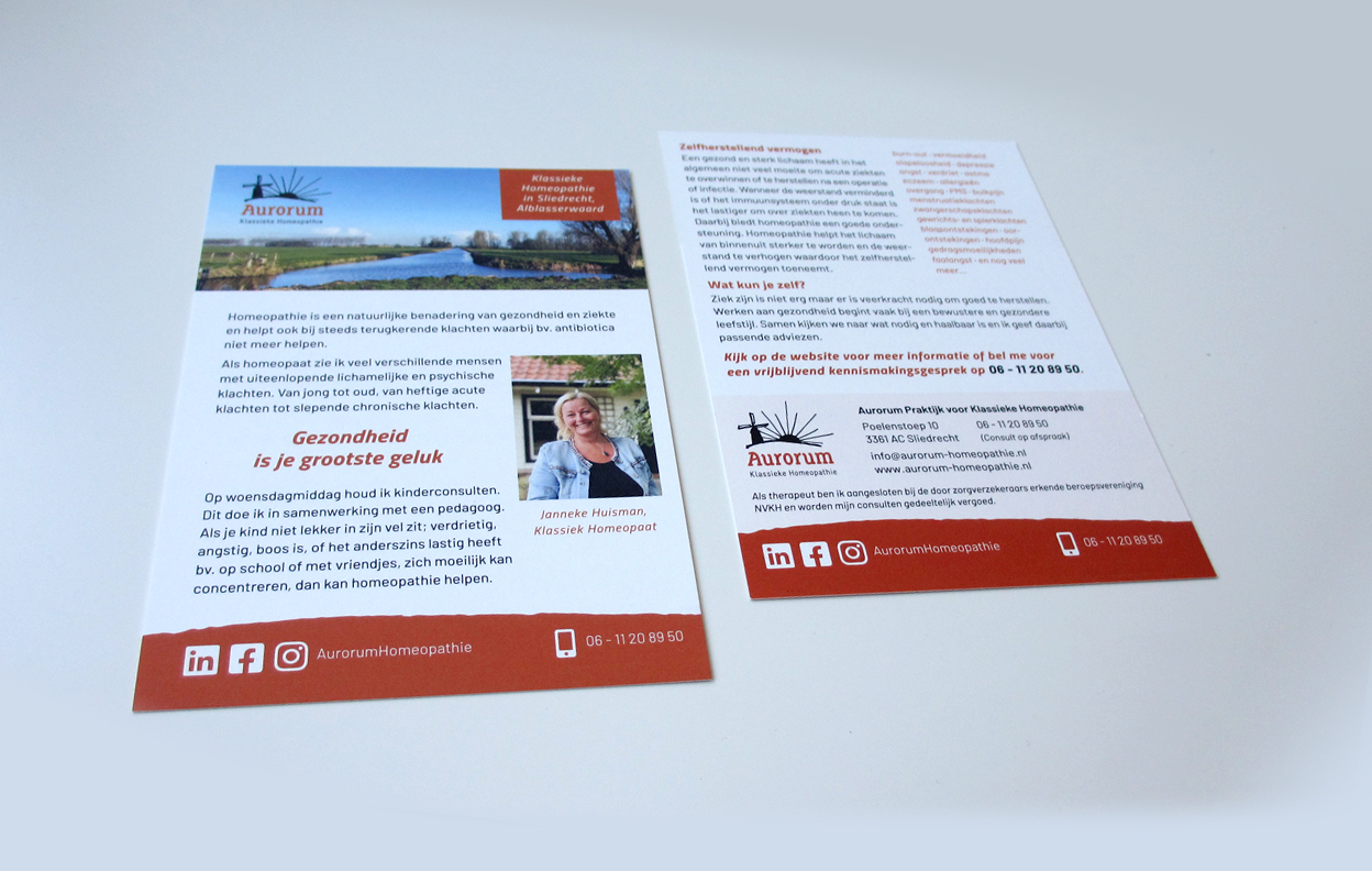
The business card shows several indications on the back for which homeopathy can be applied. The promotional card is an extension of the business card, in order to give on the flow a bit more of an impression to people of what homeopathy can do for someone’s health.
Also part of the corporate identity is Aurorum’s website.
Tasks
- Analysis of the company, strategy and target
- Graphic concept development
- Grafisch design
- Type design
- Prepress
Portfolio / Graphic design
About MissPixel
Global entrepreneur
Based in Barcelona and working in the cloud, I love international flavoured collaborations. I’m fluent in English, Spanish, Dutch, German and French, like to travel and am curious about different cultures. Your project can be discussed in your office enjoying a cup of tea or we can set up a Skype call. There's always a way to communicate!
Skills
In 1998, I earned my bachelors in graphic design in Breda, The Netherlands. Just as the internet bubble formed, I moved to Spain and eagerly studied web design and interfaces on my own. Now, I combine design with teaching, as I love to share my knowledge with students and clients alike. A full work history can be found at MissPixel’s Linkedin profile.
Balance
The joy of work is in the balance: organising and taking care of customers in the user experience field, mathematical challenges in HTML coding and composing bright colourful palettes on screen and paper.
These three perspectives harmoniously come together into one goal: making people happy with useful and beautiful designs. Boy, do I love my job!
