Telepolis
Design: 2000-2004
Offline since 2013 due to a fusion with Orange
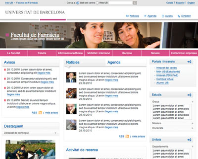
In 2000, I started my internet career at Telepolis. It was a Catalan portal, a real pioneer, that introduced itself as the first search machine in the Spanish market. It disposed of its own editorial staff and embarked on writing their own content. Hence, it’s of no surprise that Telepolis was renown for its quality journalism. I personally felt like I was part of a 120 member strong family filled with young, dynamic people working at a very cool and interactive school paper.
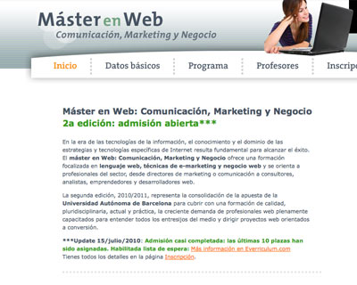
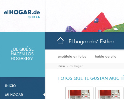
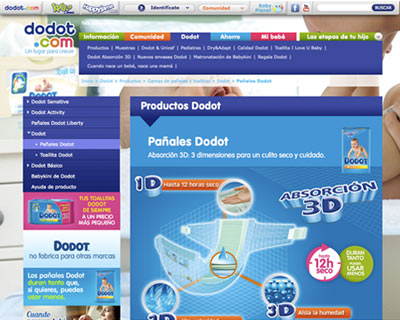
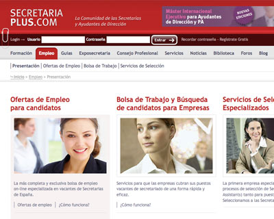
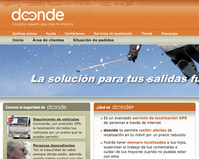
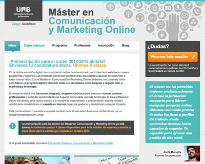
Together with my design colleagues, I worked on the graphic user interface of several different projects. Every Friday ‘El weekend’ was published which contained an article and interview with a famous person — unknown to me as I was recently immigrated! Many ‘Monográficos’ about a particular theme were written. Every morning, thousands of users received a newsletter with the headlines of the day. Special events were covered in so called ‘mini sites’. We took care of the publicity and every now and then we threw in some traditional graphic design on paper, such as a press card or certificate.
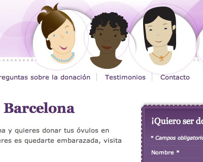
Telepolis was also a precursor of what we now know as online communities. We set up ‘Los distritos’ where every member was in charge of their own thematic Distrito. I designed its graphic interface and several ‘skins’ (colour combinations) so that every distrito owner could choose the look and feel of his choice. In 2001, the magazine PC Manía proclaimed ‘Los distritos’ as the best and most beautiful online community in Spain.
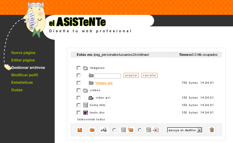
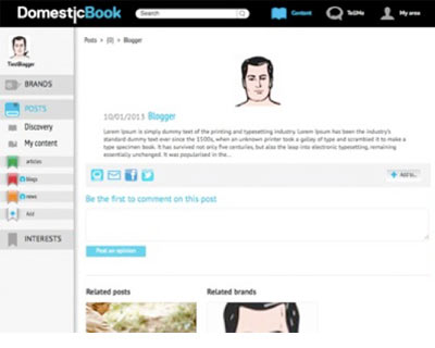
The technical team developed a multitude of online applications, among them was an instant messenger service, a chat room and the ‘DDV’ (an online storage application). In order to have users generate their own content, Club Telepolis was set up, where every member received 20mb to design their own website within the Telepolis domain. Those without previous design knowledge were certainly not forgotten: for them, ‘El asistente’ was developed. It was an online application which allowed for quick and painless web creation thanks to the available templates and simple design. My goal was to make this as straightforward as possible, which is why I gave a face to the application. I illustrated a butler who helped you create a customised website.
Besides the graphic work, I learned HTML, CSS and scripts. In every project, I aspired to try new things, pushing my boundaries with the generous help of the technical team.
All of these projects were made to look beautiful, be usable and have incredible functionality. Unbeknown to us, this was the start of the concept ‘usability’. I couldn’t have wished for a greater and broader start to my internet career!
‘We share some projects in a internal customer <-> internal provider role and just to say that she is a great designer and an excellent colleague that not only knows how to do her job but also understands needs and priorities of her colleagues. Just to say she has a very complete profile.’— Sergi Navarro, Marketing Telepolis
Tasks
- Design of graphic user interfaces: websites, online applications, software, multi platform applications
- Design and development of skins
- Graphic design: logo, press card, certificates, mugs
- HTML with evolution of old school HTML to the use of CSS and semantic HTML
Portfolio / Web design

About MissPixel
Global entrepreneur
Based in Barcelona and working in the cloud, I love international flavoured collaborations. I’m fluent in English, Spanish, Dutch, German and French, like to travel and am curious about different cultures. Your project can be discussed in your office enjoying a cup of tea or we can set up a Skype call. There's always a way to communicate!
Skills
In 1998, I earned my bachelors in graphic design in Breda, The Netherlands. Just as the internet bubble formed, I moved to Spain and eagerly studied web design and interfaces on my own. Now, I combine design with teaching, as I love to share my knowledge with students and clients alike. A full work history can be found at MissPixel’s Linkedin profile.
Balance
The joy of work is in the balance: organising and taking care of customers in the user experience field, mathematical challenges in HTML coding and composing bright colourful palettes on screen and paper.
These three perspectives harmoniously come together into one goal: making people happy with useful and beautiful designs. Boy, do I love my job!
